The theme for 52Frames this week was Extreme Contrast. I went for a walk this morning, and first saw a nice reflection of the sun between branches in a puddle. I looked above, and was greeted by these beautiful tree silhouettes, and the sun peeking through both the clouds and the trees. I only had my phone with me, but I think it still did a good job of capturing that moment 🙂
The reveals for the 27th Photography Scavenger Hunt are done… which means I get to post my Behind the Scenes blog post, with all that I did for this round!
It’s been a tough round – I didn’t manage to do anything in December – December tends to always be a silly month, and December 2019 was a VERY silly month.
My January went a bit better – well enough that I found SOME inspiration for at least SOME of the words, and I even got a few pictures that I really like. A few of these started as “backup shots” – but generally speaking I’m not ashamed of anything I submitted this month (although I’m not necessarily HAPPY with everything I submitted.) And more importantly, I learnt a ton of things in the image processing/photo editing domain, and I gained some experience in “how to do things so that I avoid painting myself in a corner”.
Anyway, without further ado: my set of pictures for the Round 27 of the Photography Scavenger Hunt – roughly in the order where I decided I’d submit them.
Car
For the “car” theme, I was wholly out of ideas until I remembered that trams were also called street cars – and that I live in a city with a lot of trams. So I first went out with a camera around tram lines, and didn’t really get anything fun there. But then I also remembered we have a funicular, and that this funicular happens to run near a few tram lines too – so I went to a place where I could get both in the picture, spent some time for a (street) car and a (cable) car to synchronize (That actually happened fairly early, and not as well later on…!), and got a few shots, including this one, right out of darktable with essentially nothing done on it – it’s exposed on the left because I wanted to keep options for the sky there.
The first image processing was in darktable – exposure, straightening, cropping. For the cropping I considered cropping more in the bottom of the picture and framing the tram below in a “cleaner” triangle, but I liked the picture less, because then I had a tendency to crop more sky as well to re-balance it, and I like that sky, even in B&W.
I was still not suuuuper convinced by the image itself, which is, in all fairness, pretty boring. So I decided to have a bit more fun with it, and pushed the cheesiness factor to 11 by getting my cars selectively colored – which is not something I had much experience with before, so that was a way to push my own boundaries when it comes to technique too. I wondered if I should also re-saturate the “regular” cars in the front; I decided against it because I think the image stands better “on its own” (i.e. without the reference to the theme) without them.
I did that operation in GIMP, and I will admit that I got suuuper lazy there – it’s probably ill-advised to pixel-peep on that picture, because the resaturation was definitely large-stroked. I decided I was happy enough with that and that I wouldn’t be much happier with a lot more time spent on that, so I decided to ship it that way 🙂
For Steps, I wasn’t very inspired – I have a few shots of stairs in front of Grossmünster (eh) that would have served as backup… until I remembered that there was PROBABLY some stairs going to the lake and that it might make an interesting picture. And indeed – there are a few stairs here and there; I consequently have a large amount of pictures with different lights and different handling of the polarizing factor, and this one ended up being my favorite raw one:
For the final picture, well, mostly basic edits in darktable for crop, exposure and so on – removing a bit of bird droppings on the steps too while I was at it, and there, picture!
I guess that goes for “another technical shot” for this one. My first idea of light trails was quite obviously getting some night long exposure somewhere – possibly around the train station, or to find a busy place, or possibly to go on top of the local mountain and try to get a long exposure of the city and hope for the best. Then I played around with the idea of doing some word light painting (because I’d never done that), and one thing led to another, and I ended up with playing with lights along a contour of my guitar.
There’s been a lot of shots for this one – for various reasons. First, as mentioned – never did that before, so I had to make things work with regards to the general exposure, the lights, etc. I ended up shooting in a dark room, with a fill light on the left of my camera, and moving another light along the guitar while the camera was exposing. Both lights, by the way, are Lume Cubes – the fill light was a white one with a diffuser, the “moving things around” had a red filter, a yellow filter, and a snoot. It took me quite a while to get a reasonably clean contour of the guitar in one pass (I kiiiind of didn’t want to assemble multiple shots, so this thing is a single shot), especially at the bottom of it, but I finally found ways to make it work (it did involve holding the cube on the guitar and moving it around, essentially – and not worry too much about being in the picture when I was passing in front of it for the bottom), and I ended up finally with this one:
Edits were all done in Darktable – cropping, cleaning the background and the final piece of light at the bottom, playing with the exposure of the guitar, and finally calling it a day. I’m not SUPER HAPPY about the sharpness of the guitar itself, and I think I could have made it better, among others by compositing with a shot where I don’t move in front of the guitar (which doesn’t help for sharpness) and/or a properly exposed one (here it’s vastly underexposed because the important thing was the light trail, for which I didn’t want to risk losing color). But hey, I made a new thing 😉
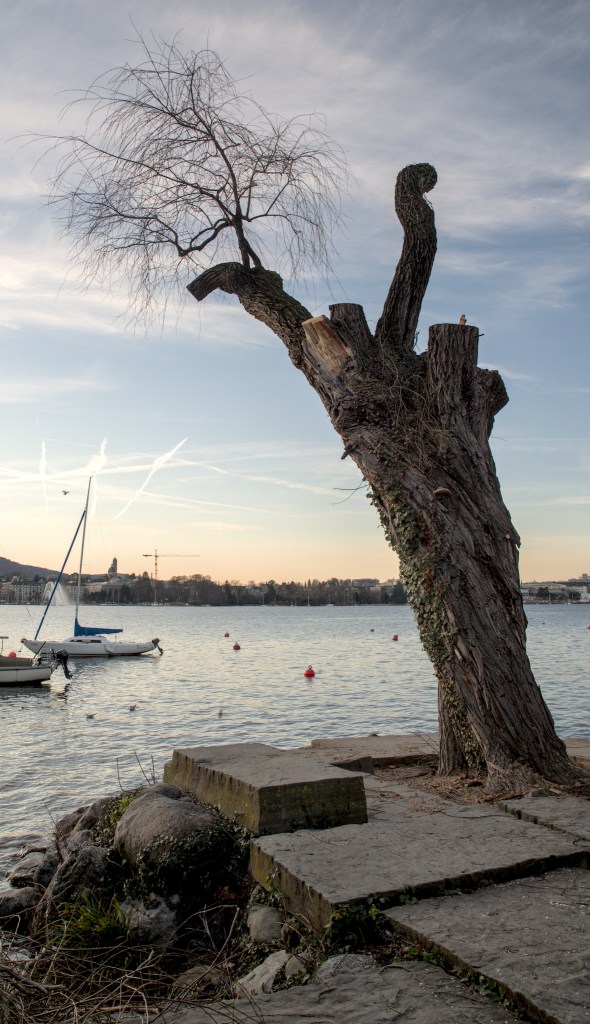
My “Time” picture may raise a couple of eyebrows in terms of “I… don’t get it”. I would probably need to rename it “Scales of time”. This is actually my favorite place in Zürich. The view over the lake is pretty, you can see the Alps in the background, and more importantly, this is “my” tree – I decided a few years ago that this tree was “mine”, and that’s it 😛 And, as the map of Zürich tells me, it’s an eastern cottonwood (some kind of poplar) that’s been planted in 1930 🙂
And as I was visiting “my” tree (while having the Scavenger list on my mind), I realized that there was a myriad of scales of time visible in that picture – the second, for the movement of water; the minute or the hour, for the people enjoying the view; the day, for the sunset; the season, for the winter in the naked tree; the span of a human life; the span of a tree life; the geological scale of the mountains.
So… maybe this picture will only make sense to me for this theme. I don’t really care 🙂
And as for the original picture, pre-edits:
(Yes. I seem to be underexposing in camera these days. It seems to work okay for me in post-proc 😉 ). I’m a bit annoyed that I’ve had to cut the top of the tree to be able to rotate the image so that the horizon is, indeed, horizontal – but it bothered me more to have a tilted horizon than missing a few branches at the top of the image. So… eh.
Profound lack of inspiration struck again for “Jam” – and I knew it was probably going to stay. So on a whim, I took what I thought would be a “backup shot” with my phone while shopping for groceries the other day:
And when I arrived in front of my computer, I had a moment of “Huh. This is actually… This would definitely not be the worst picture I submitted to a Scavenger Hunt”. So I did some minor edits to emphasize the geometry of the image, played a bit with the colors and sharpening, and called it a day. And indeed, this is NOT the image I like the least for this hunt 😉
The funny thing is that, during the reveals, people were mostly commenting on the amount of choice. Coming from France, this feels like the “lower standard end” of what I would expect to find in a large supermarket – there’s more quantity of each choice, but not necessarily more choice per se 🙂
This has been a tough one to choose. When told “row”, I have a fairly vivid image in my mind – this one, which I took two years ago. And, somehow, I didn’t manage to get beyond that for this submission to the Scavenger hunt. Except… the pictures I have for this hunt are actually weaker, in my opinion, than the “inspiration”! But oh well. Please have a row of birds and a row of boats 😛
The original picture was taken with a Sony NEX-7 (which I don’t know as well as my camera 😉 ), and in all fairness the B&W treatment has more to do with trying to “salvage” the image than a real artistic statement 🙂
And I usually do not have two fully processed pictures for my scavenger picture… except today I do. I did hesitate between both for the theme; the one I ended up submitting fits more clearly to the theme, I think. But since this is my blog and I do what I want, here’s the one I DIDN’T submit:
I guess this one is… me being a smartass, or something. Inspiration was, yet again, not my forte (I sense this is a theme for this Hunt, right?) – and I saw the bottles of syrup in the middle in the supermarket the other day. I went “OKAY, I’m getting a backup shot, because WE NEVER KNOW”, and next thing led to another, I started looking in shelves for all the lavender scented things I could find, and there’s actually quite a lot 😛 So I went for it, this is my “Lavender Scavenger Hunt”, I got nine of them in two supermarkets, can you do better? 😉
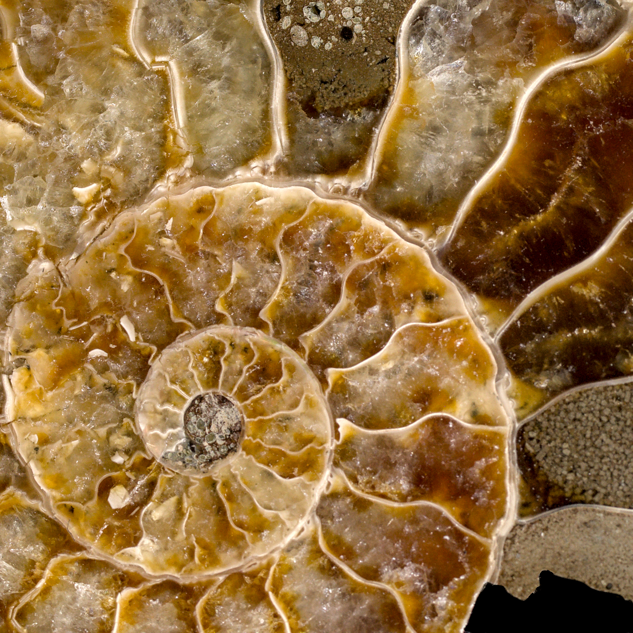
When walking in Zürich looking for Row and Steps and whatever I could find, I saw in the display of a jewelry store a pair of earrings that were ammonite shaped. I almost snagged a picture…. and remembered I had a small ammonite the my little mineral collection I started last year! From there, the “spiral” theme because pretty obvious.
It took me more time than I expected to get a “clean” picture – I’m not sure if I’m getting worse at this or if my standards are getting higher (I suspect more of the latter) (okay, I want to believe more of the latter 😛 ): I had sharpness issues, I had light issues, I had all the issues – until eventually I cranked the tripod and the remote, and switched to my macro lens, and made my life actually easier. (Surprising, eh?). And one of the 30-ish shots I took was finally satisfying and workable:
The edits were fairly basic – the most annoying part was to get a proper clean black background. I think next time I may consider shooting on green screen and make my life easier when it comes to cutting out the background.
And yes, I cheated a bit – because I also submitted this picture, in another form, as my 52Frames “Fill the frame” entry 🙂 And, in complete fairness, I think I do prefer the 52Frames version (I need to experiment more with tighter crops than I usually go for, I think), but it felt less “spiraly” than this one.
For quite some time, I had… 0 idea for touch. And then I went to Google Images, and, well, searched for touch. Which eventually led me to the concept of “Midas Touch” – the legend in which Midas, king of Greece, transformed everything he touched into gold. So I then looked for things in my house that I could POSSIBLY have in a picture of stuff turned to gold, and I settled quite rapidly on our water pot. I first got a quick picture, vaguely validated that it seemed POSSIBLE that I could do what I had in mind. Then I went for a “better” picture to work with. I had noted, in the initial attempts, that getting a yellow reflection from my tablecloth COULD be something I’d want, so I went for it. Took a few pictures, eventually settled for this one:
The basic edits were basic, but then I literally spent hours in GIMP to achieve the final result. And I went through three iterations of the image too. I’ve been told that I may have tried to do this picture in “hard mode” – starting from a reflecting material and trying to edit it into a metallic material may have, indeed, been…. optimistic, considering my general amount of photo editing skill.
Buuuuut I did learn a lot, including in how to manipulate my selections and my layers and my masks and everything, and in how to define my own brushes in GIMP, and so on and so forth. The final image IS a bit disappointing, but the experience and competence I built is invaluable 🙂
I guess that the inspiration for this image is obvious for anyone who’s done the Hunt for a while – hi Dave!
This is the last image I shot, and really the one I thought I’d didn’t get. I was simply out of ideas; and the weather around here as been mild enough all winter that the occasion to shoot some frozen vegetation have been rare… and I missed all of them.
I eventually remembered that I have a Metal Earth AT-AT, courtesy of a colleague who enjoyed assembling it but who thought I’d enjoy the end result more than he did, and what better prop for a “frozen” theme than a thing highly associated with a frozen planet? Well. There’s also obviously… well… Frozen, the animated movie(s). And in my mind came the idea of having Elsa fight said AT-AT on a frozen surface, because duh.
Which meant – I needed an Elsa. My first attempt to find one failed – the first toy shop I went to didn’t have what I wanted in terms of look, size, and general inspiration. Which again meant… the deadline day for the Hunt was there, and I didn’t have a Frozen picture. So I went to a second toy shop, thinking I wouldn’t find what I wanted, but still thinking that at least I would have tried. Aaaaand I found an Elsa I thought I could work with.
I went back home, I set things up in my soft box, and I started shooting. I wanted a blue-ish light, so I put a lume cube with a blue filter on top of my lightbox; I spread some flour on my surface (I did remember Dave mentioning that flour made surprisingly good snow for toy photography 😀 ), and I shot the base for the picture.
Okay. This is not entirely true. I wanted this picture in, because it shows better the scale of what I was starting with. But I knew that it would probably make my life much, MUCH easier to have two different pictures. So I took independent pictures too:
The important thing for it to work was to have consistent lighting, because I knew that Elsa would DEFINITELY not be to the correct scale with the AT-AT in the initial picture, and that I’d have to reintegrate her smaller somehow. So I was careful with my lighting and camera setup to get consistent shots I could work with. I then edited the RAW in darktable with literally the same stack of edits on both pictures, to keep consistency still, and I ended up with pictures I could work with.
Then I started playing with Gimp – took the Elsa picture, and started removing the background to get a pastable selection. I eventually got that (this is NOT work I particularly enjoy, I must admit…)… and I realized when pasting the image that I had made a mistake in my darktable process: I had applied a monochrome filter, because I was being lazy with the handling of the colors – it felt… complicated to get right. But it made the final image waaay too unreadable – Elsa needs to be smaller than the AT-AT, and in B&W she was just not very recognizable anymore – I think the blue dress and transparent cape help a lot.
Buuuut instead of despairing that I had done ALL THAT WORK FOR NOTHING, I re-exported the image from darktable without the B&W, and I managed to move my mask/selection from the B&W image to the color one – which worked perfectly fine 🙂 (So yay, I learnt how to unpaint myself from a corner!).
I went for image readability versus accurate scale – let’s say it’s a…. alternate universe AT-AT, which is super small compared to the ones we know? 😛 And all in all, I am super happy with the final image – it’s definitely in my favorites for this round, possibly even my favorite 🙂
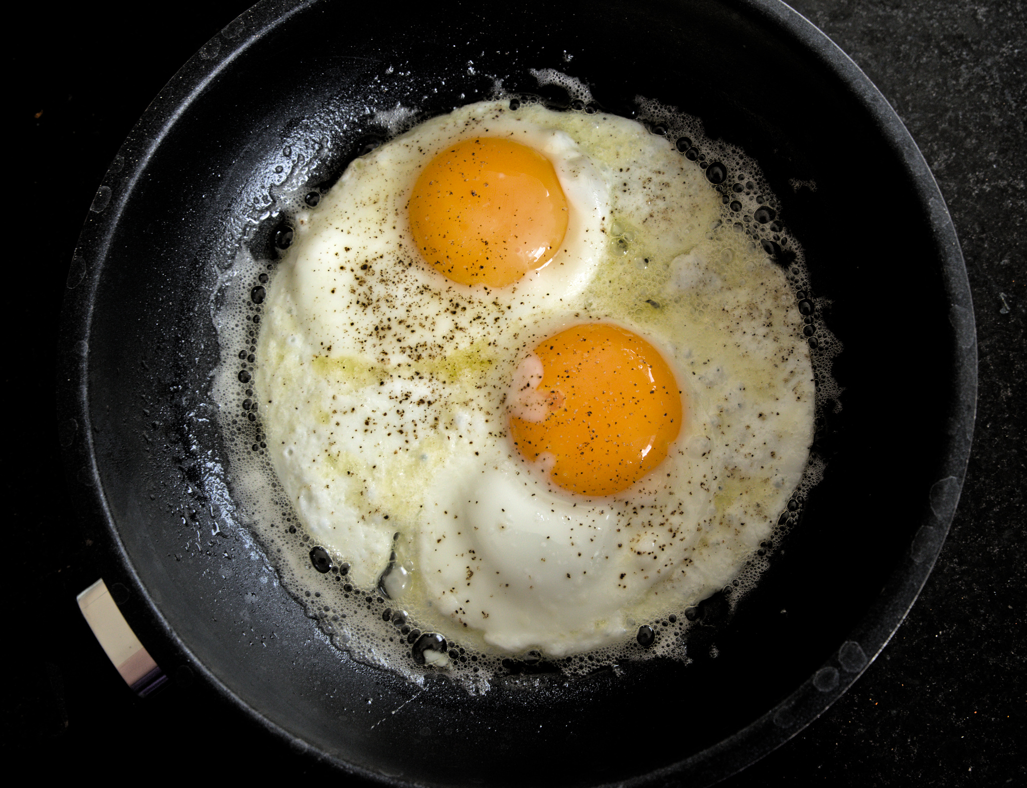
This week the theme for 52Frames was Pairs. I submitted late last week, so I submitted early this week!
I didn’t have too many ideas – until I realized I could plan my lunch to get a pair of eggs in there (and that’s exactly what I did when I finalized the menus for this week :P). Sometimes photography creeps in other places of my life! 🙂
I try to submit my 52frames entries earlier in the week, but it didn’t work out this week – I still submitted on time (which makes this week my 7th week in a row, yay me!).
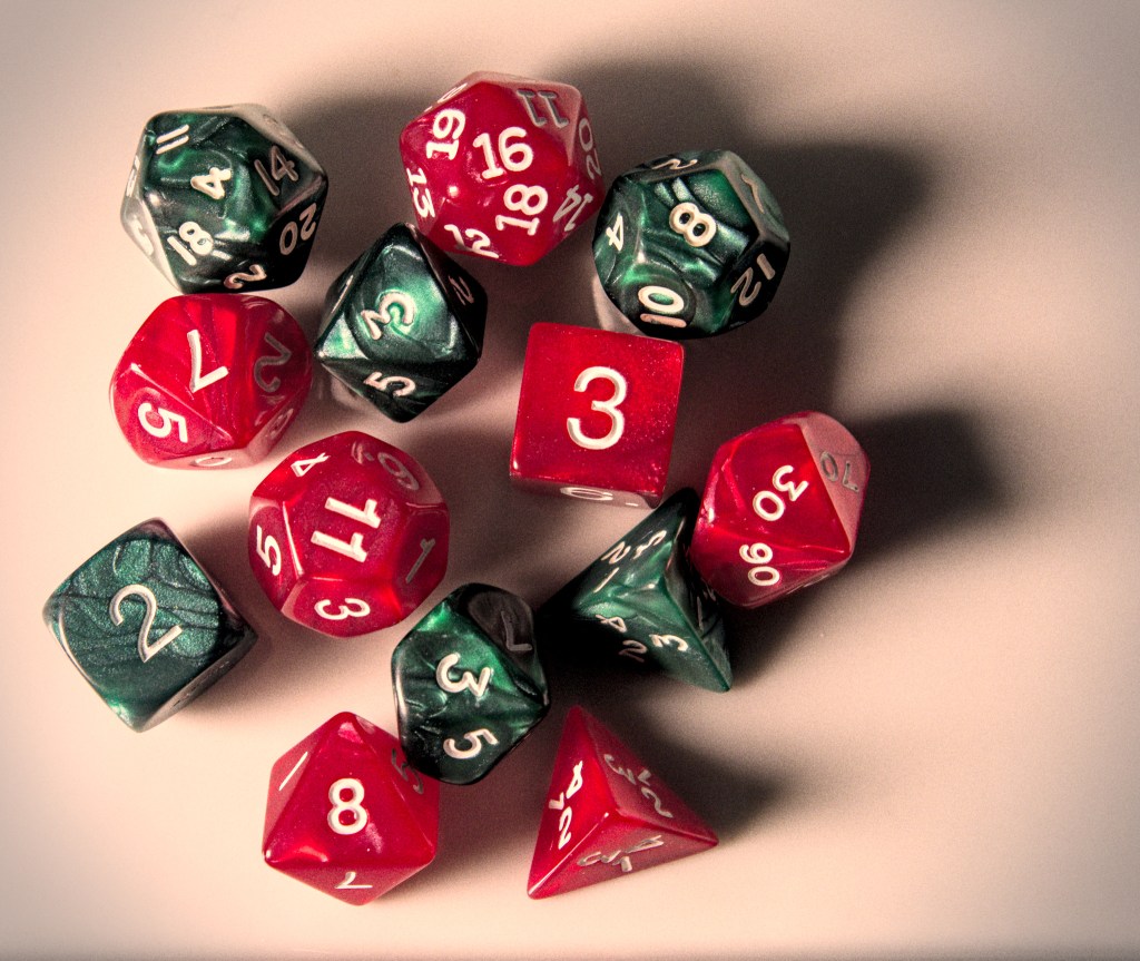
This week’s theme is “Intentional color palette“, with an extra credit for “Flatlay” – that I claimed as well. I’ll admit it was a “lazy shot” – you want color, get some dice on a plate, light’em somehow, click picture, done. Probably to “compensate” the laziness of the shot, I ended up going for slightly more “creative” edits than I usually do – I even added grain and vignetting, what has this world come to!
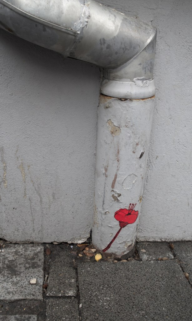
The theme for this week’s 52frames challenge is Rule of Thirds.
I’m participating to a test-drive of “photo mentorships” – more on that later, probably, it’s still in closed beta 😉 Buuut part of the gist of the task for this week was to try and get the composition “right” in camera, in particular when it comes to framing the right things – not too much, and not too little. It was, incidently, a very interesting exercise – despite the snow that accompanied me for most of my walk today. And the constraint was to post it “straight out of the camera”, which is… a challenge for me 🙂
I’d like to say that this picture is exactly one of these “straight out of the camera” pictures – but I can’t say it is – there’s been a bit of fixing horizontals, a bit of cropping, and a bit of color edit on this one.
The “extra credit” for this week was “street photography”. I must admit that I did hesitate claiming it – for sure this doesn’t fit the “canons” on street photography. But, to me, street photography is about people and humanity, and I find the act of adding that poppy where it is to fit very well with that idea 🙂
The base story of Permafrost is about a group of people who travel in time from the future, trying to fix a past catastrophe so that they have a chance to survive – because in their time, humanity is literally starving to death. They travel through time in a somewhat “Quantum Leap-y” way: “hosts” are identified in the past, and get to be controlled by the time travelers for some amount of time.
It is, generally speaking, a good story. But it did get pretty messy at time, and I think I would have liked a little more hand-holding. The amount of twists and turns in such a short story was, however, absolutely delightful. At less than 200 pages, it apparently counts more as a “novella” than as a novel – I think I may have preferred a slightly longer form; but as it is, it was a pretty neat way of spending a few hours still – very hard to put down, that’s for sure 🙂
Spinning Silver – Naomi Novik
It’s fairly rare that I finish reading a book more than two months after starting it… because usually, it means that I gave up on it rather than taking more time to read it. For Spinning Silver, I knew I wanted to finish it; I also knew I didn’t necessarily have the right mindset to finish it fast (I’m starting to get better at knowing whether a book is “not for me” or “not for me this week” 🙂 )
Spinning Silver revolves around three young women. Miryem comes from a family of moneylenders; she decides to take things in her own hands when understanding her father’s inability to collect debts (which, for a moneylender, would be problematic, I suppose). She gets helped by Wanda, who repays her father debts by working for Miryem’s family. Miryem attracts the attention of the Staryk king – local ice realm boogeyman – who challenges her to change his silver to gold. And said Staryk silver ends up in Irina’s possession – a small duke’s daughter, who’ll end up marrying the tsar, who may have a secret of his own.
The pacing of the novel is pretty slow, but the telling is very vivid (my “brain imagery” is quite detailed), the language is beautiful, and I just don’t see anything I didn’t like in this book. Very highly recommended.
Trade Me – Courtney Milan
My Twitter got a high amount of content about the Romance Writers of America association leadership recently, and a side effect of that was that it made me aware of Courtney Milan. Courtney Milan writes romance, and she’s also the initial author of the Jurassic Emoji proposal (thanks to which we eventually got the 🦕 and 🦖 emoji :D) Long story short, since Twitter is apparently my way of discovering romance authors, I started reading Trade Me.
The premise of the story is not suuuuper-believable – Tina and Blake go to the same university; Blake is the billionaire son (and heir) of the head of a large tech company; Tina is juggling with her studies, her work, and trying to make ends meet for both her and her family. And they end up making a bet, where they’d exchange their lives for a few months, to see how it goes, and maybe revisit their prejudices. We learn more about Tina, Blake, and his father, as the relationship between Tina and Blake blossoms.
And, while I don’t 100% buy the premise, the setting is quite credible and well-documented. I also liked the interactions between the characters, including their baggage and the way they handle it – and all in all I really, really liked that book – there’s a few other in the series and I’ll probably read them soon 🙂
Planetfall – Emma Newman
Renata is one of the founders and 3D printer engineer of a small colony on a distant planet. The life there seems pretty well organized, the colony has a real community sense, tech and biotech make things work in a believable way. Until one day, a stranger arrives, which a/ shouldn’t really happen b/ is all the more confusing that he bears a strong resemblance to one of the other colony founders. And quite quickly, questions begin to arise, and secrets start to be revealed.
This is one of these books where you just have to let go of understanding everything at once – and just wait for the pieces of the puzzle to be added one by one. You may have some idea about said pieces of the puzzle, but it’s incredibly satisfying to see them added little by little. I will definitely read the other books set in the same world 🙂
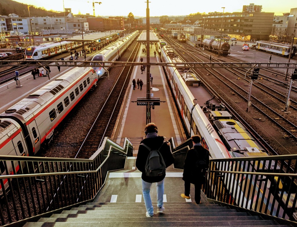
This week has been somewhat complicated; I had a couple of plans for a bit of exploration to get the “Shoot from Above” picture for 52Frames, but neither panned out. Buuuut I took the train around golden hour the other day, and I snagged that one. A bit of cropping to center the center, and a Google predefined filter later, boom, I have a submission for 52Frames.
Which makes my streak running to 5, which means that THINGS ARE GETTING REAL – now if I miss a week, it DOES feel like I’m losing something 😉 Which is exactly the point, I presume.
I was playing with my camera, a tripod, and an ammonite today, and I realized that with a bit of cropping it could make a very decent “Fill the frame” picture for this week’s 52Frames. So, after basic edits, I played with the crops and I landed on this one, which I quite like.
For the third week of 52Frames, the theme was “Wabi-Sabi” with an extra credit for Old Nature. I went for a walk in Zürich at the beginning of the week, in which I took a fair amount of pictures that could/would have worked for the theme; this one ended up being my favorite, mostly because the tree cut is so weird.
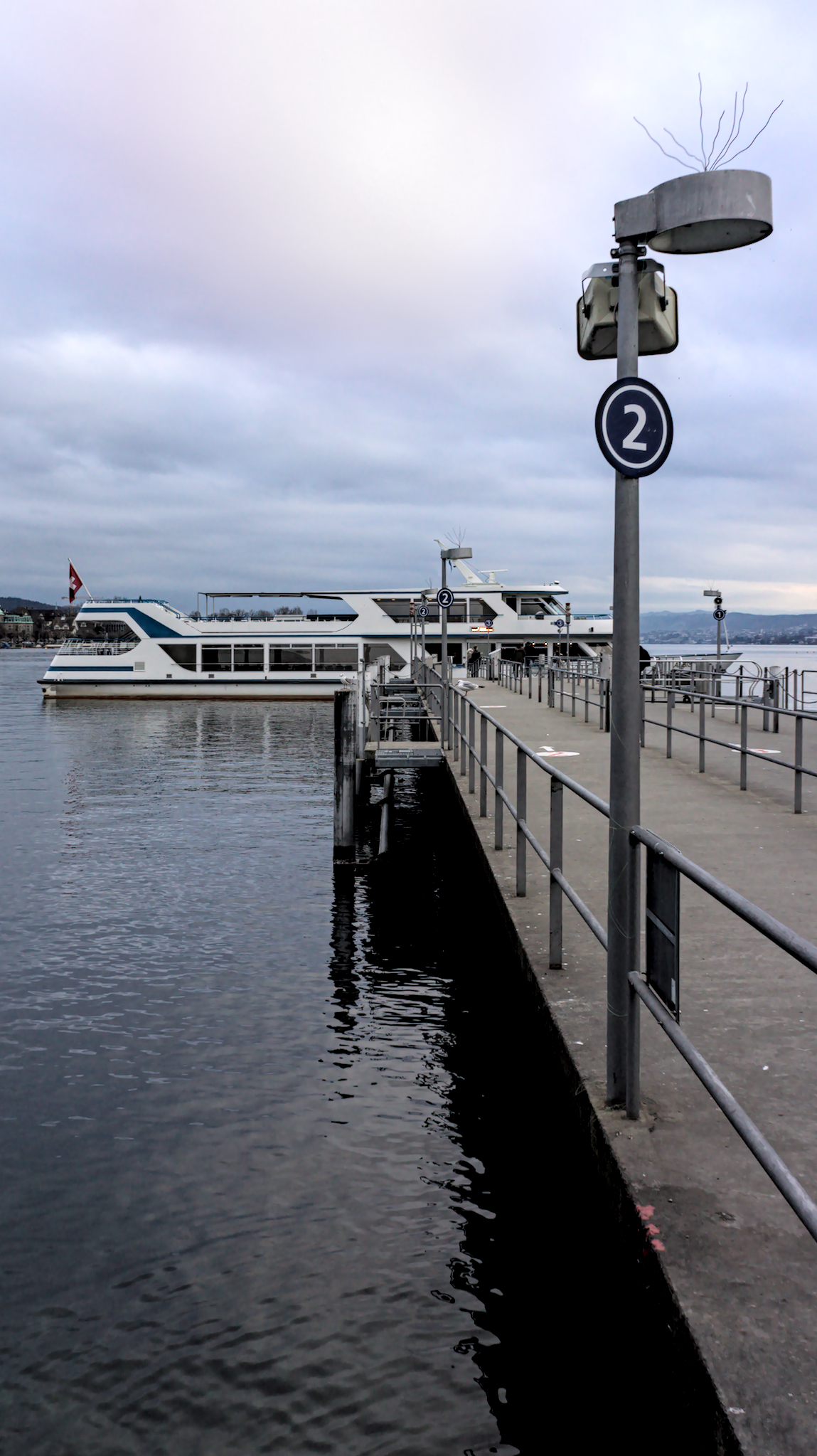
I didn’t know exactly what to do for the second 52Frames theme of the year, Leading Lines – but last week I went for a tiny photo walk near the lake. A friend of mine had lent me his Sony NEX-7 so that I could have a look at the form factor and at the general feel of it – so that was an extra motivation to go out and shoot. I arrived at the lake at the same time as the boat, so I took a few pictures; I also experimented with the spyglass that’s nearby, but I didn’t manage to get something convincing leading-lines-wise.
On the post-processing side, of note – the pink/red nuances in the sky were there, but I spent some time making them somewhat more obvious; that’s probably a bit more “creative reality” than I usually do, but I don’t hate the result 🙂