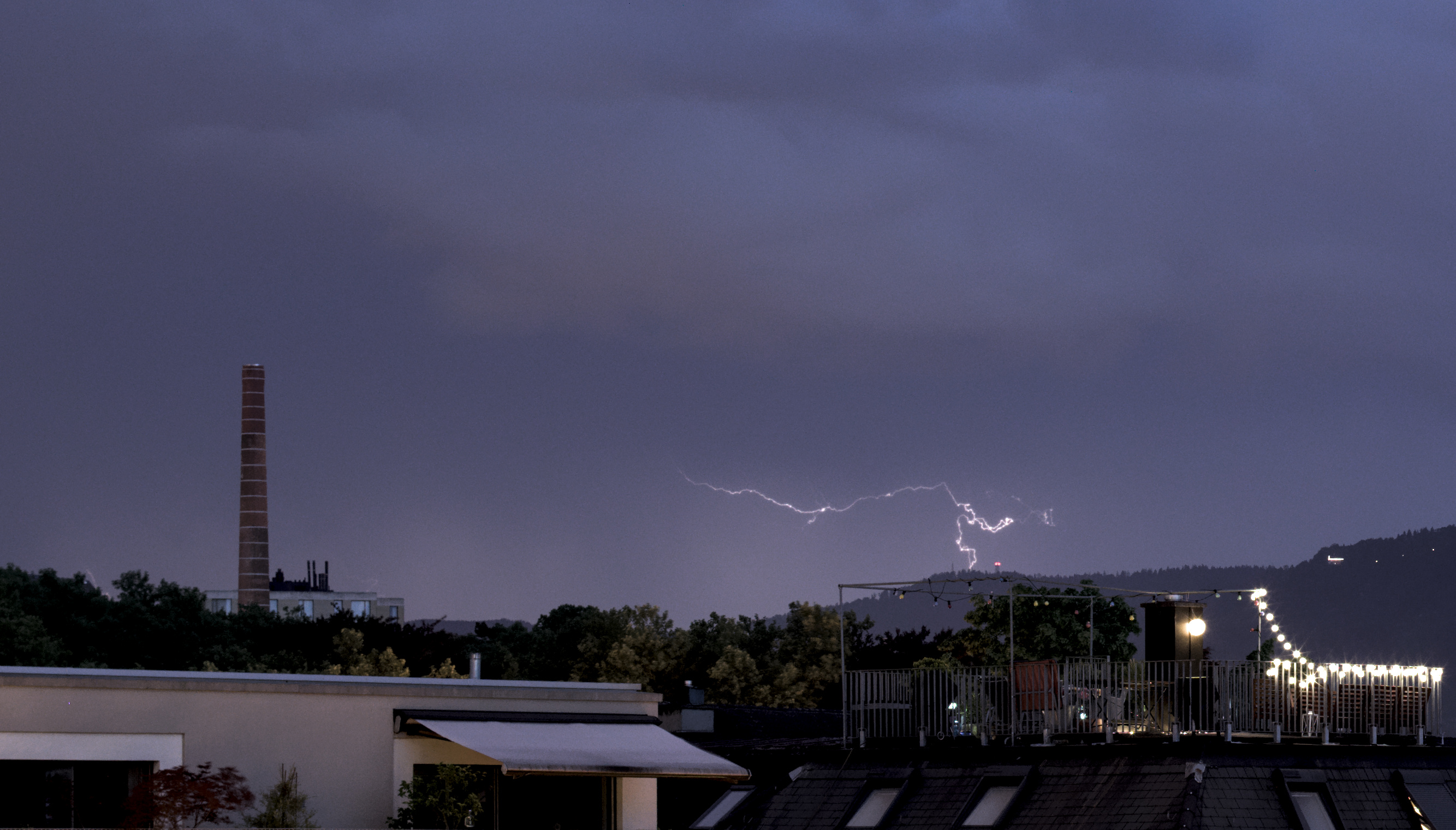
The day before yesterday there was a bit of distant thunderstorm – distant enough that there was no rain (and essentially no sound). So I got the camera out and I started playing around with it. I had never tried my hand at that, and the thunderstorm was fairly quiet (for a thunderstorm), which means I got a meager 4 reasonable pictures out of 106 exposures 😛
I enjoyed editing them and trying to get well-defined bolts on these skies. I particularly like the last one – there’s no bolt, but I really like the light and the clouds 🙂
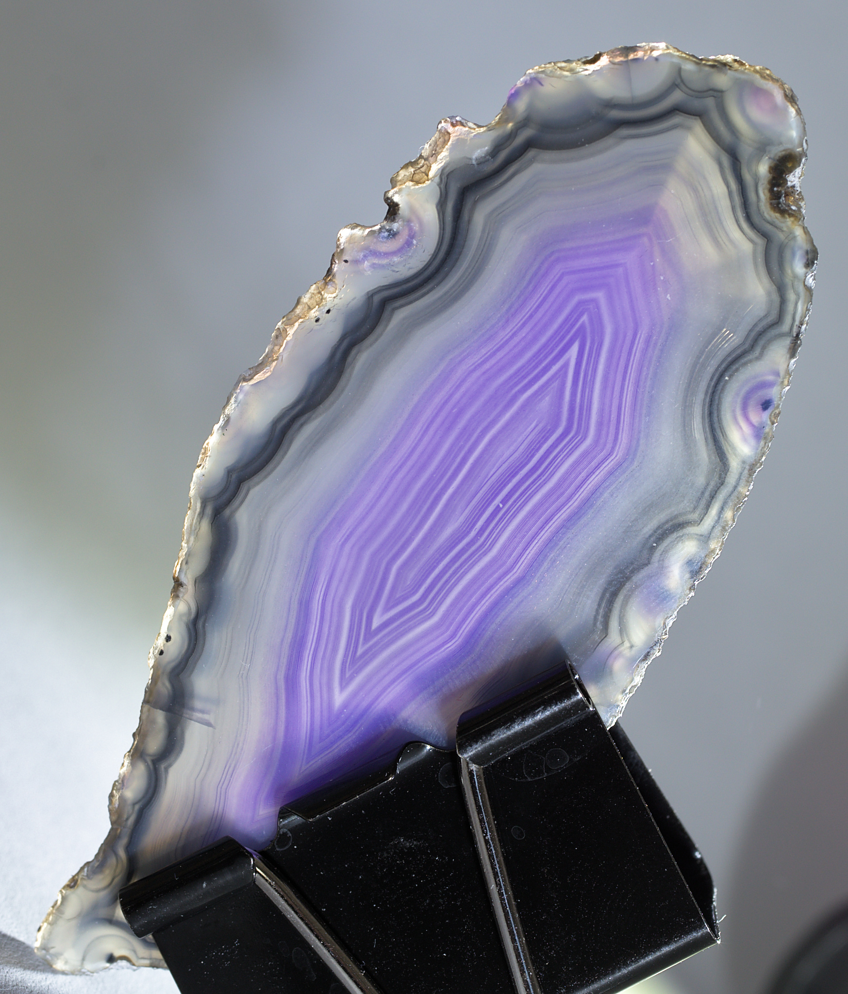
For the 52Frames theme this week, the challenge was to submit a picture with a maximum of 24 takes (or 12, or… 1 🙂 ). In all fairness, this is not necessarily much of a challenge for me, since… there’s probably more pictures than not where I take less than 24 takes.
That kind of theme/constraint doesn’t really steer my creativity – I still went through 24 shots of a slice of agate, playing with a pair of lumecubes to illuminate it in different ways. This one was my favorite – I particularly liked the golden reflection on the border on top.
And just for fun, the full roll of 24 photos in Darktable:
The theme for 52Frames this week was “low-key”. I kind of wanted to take a low-key portrait of myself – it would have been a nice complement to last week’s high-key portrait; but my regular black curtain currently has a desk in front of it (so that makes it more awkward to work with), and….. I got lazy.
Thankfully, my husband is NOT lazy, and he made some delicious peanut butter chocolates today. And is there anything better than dark chocolate for a low-key theme? I don’t think so. So, there: chocolate.
The theme for 52Frames this week was “Soft“, with an extra credit for “High-key”. Since I can’t remember doing much high-key photography, and probably roughly 0 high-key portraits, that was a nice occasion to experiment.
I kind of knew I wanted to do that today, so I did wash my hair this morning so that they’d be lighter and more fluffy/electric if I brushed them just before I took the pictures – which I did. Definitely playing the long con here.
Anyway, this afternoon I setup my tripod, my camera, my lights, the diffusers for the lights, my remote, and I took a few self-portraits. Or, you know, casual quick selfies 😉
I normally expose to the left of what I actually want, which means that for this one I exposed center 😉 That’s my original picture, with the same crop as the final one, for comparison:
The processing was pretty fast because I also knew what I wanted to do there – both in terms of exposure and colors, and in terms of softness. I played with the corresponding Darktable modules (mostly filmic rgb, soften, local contrast, color zones to decrease the read component, white balance) until I got a result I was happy with.
All in all, from “start of setup” until “picture processed and everything back in its place”, this was a fairly short endeavour – an hour and a half, roughly. It was made easier by the fact that the “photography” side of it was actually fairly limited: once the lights were setup and I was happy with the camera framing, I did a single sequence of shots, and I didn’t have to go back to the camera once that first sequence was taken – the first results were “good enough” as they were.
Well, I think this one may hold the record for “number of shots taken for a single image” – I currently have more than 300 pictures on my drive for this theme (with a LOT of them actually not showing anything).
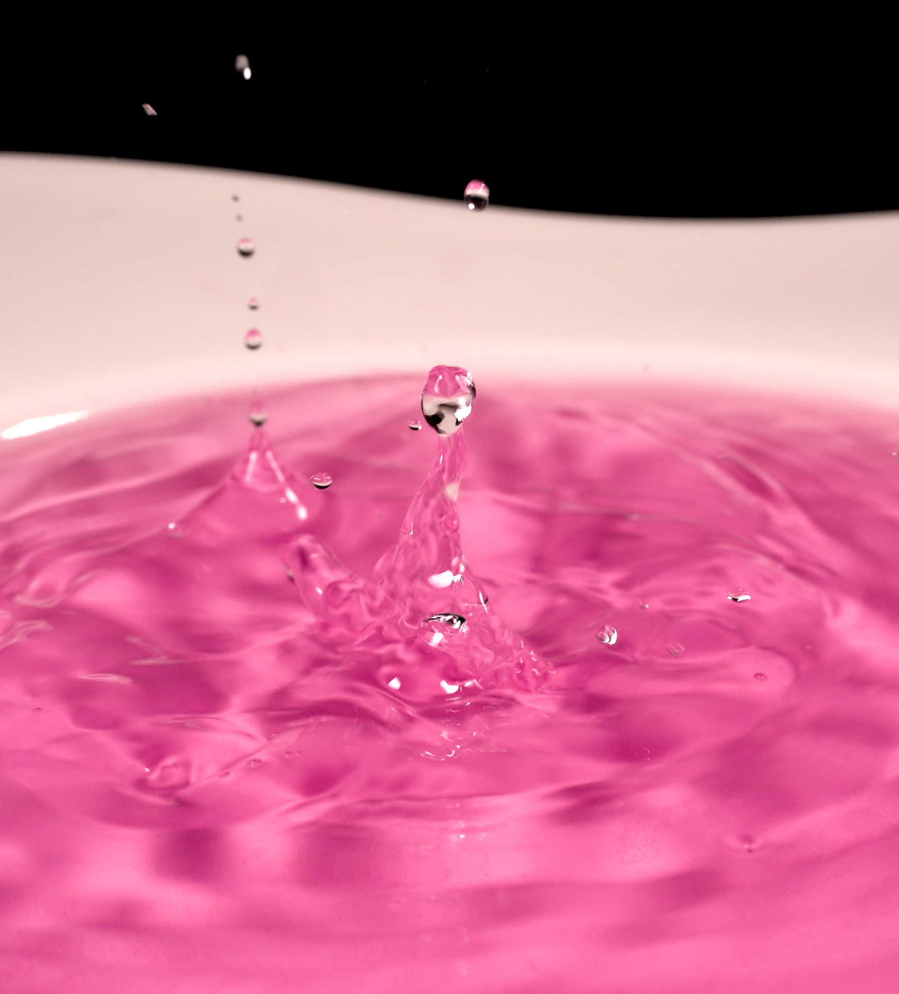
The 52Frames theme this week was Fast Shutter Speed, with an extra credit for Drip Water Photography. I kind of always wanted to experiment with drops and liquids and so on, so it was actually the right opportunity for that. I first vaguely looked on the Internet to try and get an idea of how to achieve that, enough to get me started, experiment, experiment again, experiment again, and eventually make images I liked 🙂
The very beginning of the experiments looked like this:
I hadn’t colored water yet, and I was trying to setup focus in a reasonable way, by using a small red thing (technically the plastic brush for the garlic press :P) where I would expect water to drop when I’d drop it. I had set up a couple of lights too, because for sure I needed MOAR LIGHT to be able to increase the shutter speed at a level I wanted.
The final setup ended up with the water plate set on a higher plane (actually, the yellow kitchen trolley behind me, minus the yellow cover), the same set of lamps, and a bit of ink in the water to get a more colorful shot.
What ended up working, generally speaking:
After a few experiments at both slower and more rapid shutter speeds, this one was taken at 1/500s – anything from 1/250 to 1/2000 seemed to work okay to get at least SOME images.
This means: Light. More light. Even more light. Seriously: never enough light. The reason for me to move the plate higher up was to get more of these precious photons, considering the fairly high tripods that my LED panels were mounted onto (I could have played it differently, but in the end that worked out as I wanted).
Pushing the aperture as much as possible DOES help making sure that more things are in focus – this one was taken at f/10 (on a 50mm with a full-frame camera). Even if that meant underexposing a fair amount, I think that eventually paid off.
ISO 100 was a must, because that was the only way I didn’t get a picture that was essentially noise – especially since I did tend to underexpose (mostly by lack of available light and trying to cheat on focus more than creative choice)
I removed the remote quite quickly because I got lazy when it came to check exactly I could get repeating shots with that thing – I ended up setting up delay + burst of 10 pictures directly on the camera, and timing the water drops in the time where the camera was bursting, and hope for the best
Experimenting with different ways of dropping water (from more or less high, more or less quickly) was actually pretty fun. I think this one was shot with drops coming from fairly high above, fairly quickly: the water is fairly disturbed.
I only played with a little plastic bottle that had a drip opening – I’d like to play with different sizes of drops, I think.
Better having a fairly low angle on the water surface – that might require handling the background, but the results are in my opinion just more interesting.
So, yeah, that’s how I spent most of my Easter Monday. And it was a ton of fun, and I think I’ll re-experiment with that sort of things later, because I’m very far from having any kind of mastery on the process, and it’s a nice, fairly low-tech thing to experiment with (with the exception of the lights, I’ll admit).
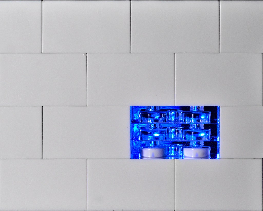
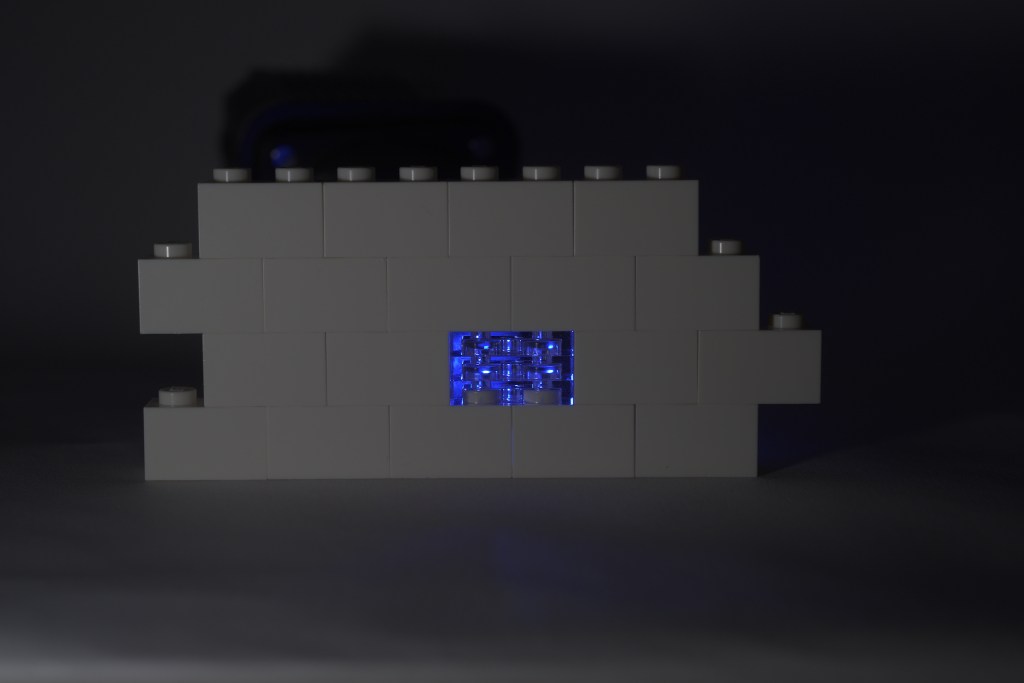
The theme for 52Frames this week was A Line from a Song. They put together a generator to provide some ideas – and there was an additional constraint for the extra credit of “using the very first quote the generator provides you”.
Aaaaand the very first quote that the generator provided me was “All in all it’s just another brick in the wall” – Pink Floyd, obviously. I’ll take that as a sign of destiny – I instantly knew what I wanted to do with that one, and I looked into more quotes from that generator, and they seemed far more difficult to me 😉
So today I gathered my LEGO bricks, my lights and my camera, and I made an image to submit for the challenge 🙂 My first idea was to have a colored brick in the middle of a white wall – turns out, I… don’t think I have any colored 2×1 brick in the house. (Maybe in the TARDIS?). So I looked into what I had, and I had transparent bricks. Except that I remembered transparent bricks having the same structure as the non-transparent ones, with a tube for the stud assembly (like that), and mine… did not (like that). That made me think that it wouldn’t be necessarily visible that there WAS a brick there – which kind of defeated the purpose.
But I also had in my collection a pile of three transparent plates – which would actually give me both the transparency and the texture I was looking for. I assembled a wall with a few brick, put my transparent plates in lieu of a regular brick, and tadaa! The shot was surprisingly hard to get right – for my first attempts, I was only lighting the wall from behind, without supporting the light on the wall itself, which made exposure a profound pain to handle correctly. Plus, my LEGO bricks were all dusty, and it REALLY SHOWED on macro shots.
I finally got a shot I could work with – took a fair amount of editing still before I got the shot I had in mind. For the record, that’s the initial shot I was working with:
I’m quite happy with how this turned out. It initially felt like a low-effort kind of project, and I was half-expecting to send this with a “eeeh, not the most creative thing ever but I submitted”, but it took more time than I thought, it felt good building the image, and that’s actually the most fun I’ve had in photography for a few weeks 🙂
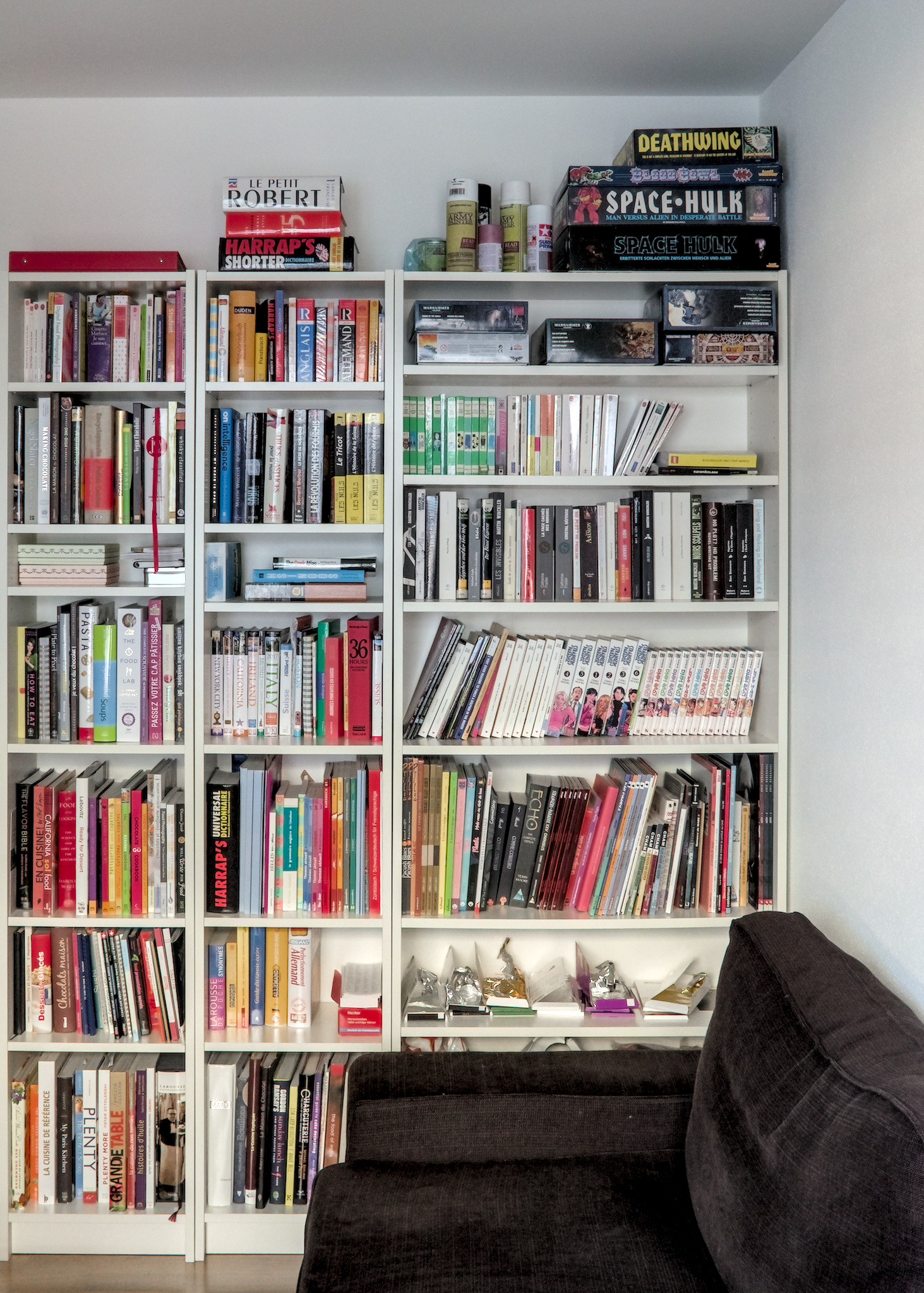
The 52Frames theme this week was Books. I got rid of most of my book collection a few years ago – but I still have a few bookshelves here and there. A large part of what I have left are cookbooks (the whole left bookshelf, andspilling a bit on the second one); and then there’s a number of things that I prefer reading on paper (comics… and yeah, cookbooks), a few “hard-to-find”, and some that I kept for sentimental value. There’s still a few bookshelves around the apartment – tech and math books are not here, RPG books are next to the board games shelf 🙂
The picture itself is quite unremarkable. I wanted to get a reasonably clean, geometric shot – which I tried to get as much as I could in camera, but which got mostly achieved by postprocessing to fix lense deformation and perspective issues. I kept the framing a bit larger than I initially thought I would – the framing felt better with the line of the couch and the line of the ceiling.
Plus, the couch and the shelf of chocolate give a bit of story-telling, which I like 🙂
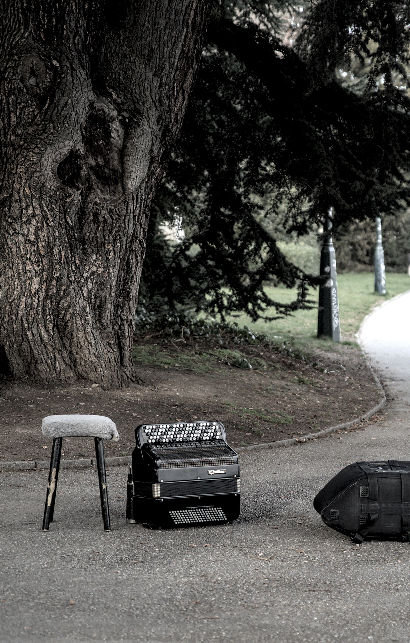
And that’s 10 in a row on 52frames – yay me 😉 The theme for this week was “Abandoned“. I had a backup shot of an umbrella that had escaped its owner on the bank of the river, but I like this one much better. We haven’t seen the owner of the accordion in the few minutes that we stayed around it – I’d assume it’s only been abandoned for a few minutes, but I still like that image a lot 🙂
I tend to push saturation on my images; on this one I actually decreased it, because it helped getting the feeling I wanted for the image. And, for a few more pictures of this afternoon, including this one: Photowalk – Mars 2020.
The theme for 52Frames this week was Extreme Contrast. I went for a walk this morning, and first saw a nice reflection of the sun between branches in a puddle. I looked above, and was greeted by these beautiful tree silhouettes, and the sun peeking through both the clouds and the trees. I only had my phone with me, but I think it still did a good job of capturing that moment 🙂
The reveals for the 27th Photography Scavenger Hunt are done… which means I get to post my Behind the Scenes blog post, with all that I did for this round!
It’s been a tough round – I didn’t manage to do anything in December – December tends to always be a silly month, and December 2019 was a VERY silly month.
My January went a bit better – well enough that I found SOME inspiration for at least SOME of the words, and I even got a few pictures that I really like. A few of these started as “backup shots” – but generally speaking I’m not ashamed of anything I submitted this month (although I’m not necessarily HAPPY with everything I submitted.) And more importantly, I learnt a ton of things in the image processing/photo editing domain, and I gained some experience in “how to do things so that I avoid painting myself in a corner”.
Anyway, without further ado: my set of pictures for the Round 27 of the Photography Scavenger Hunt – roughly in the order where I decided I’d submit them.
Car
For the “car” theme, I was wholly out of ideas until I remembered that trams were also called street cars – and that I live in a city with a lot of trams. So I first went out with a camera around tram lines, and didn’t really get anything fun there. But then I also remembered we have a funicular, and that this funicular happens to run near a few tram lines too – so I went to a place where I could get both in the picture, spent some time for a (street) car and a (cable) car to synchronize (That actually happened fairly early, and not as well later on…!), and got a few shots, including this one, right out of darktable with essentially nothing done on it – it’s exposed on the left because I wanted to keep options for the sky there.
The first image processing was in darktable – exposure, straightening, cropping. For the cropping I considered cropping more in the bottom of the picture and framing the tram below in a “cleaner” triangle, but I liked the picture less, because then I had a tendency to crop more sky as well to re-balance it, and I like that sky, even in B&W.
I was still not suuuuper convinced by the image itself, which is, in all fairness, pretty boring. So I decided to have a bit more fun with it, and pushed the cheesiness factor to 11 by getting my cars selectively colored – which is not something I had much experience with before, so that was a way to push my own boundaries when it comes to technique too. I wondered if I should also re-saturate the “regular” cars in the front; I decided against it because I think the image stands better “on its own” (i.e. without the reference to the theme) without them.
I did that operation in GIMP, and I will admit that I got suuuper lazy there – it’s probably ill-advised to pixel-peep on that picture, because the resaturation was definitely large-stroked. I decided I was happy enough with that and that I wouldn’t be much happier with a lot more time spent on that, so I decided to ship it that way 🙂
For Steps, I wasn’t very inspired – I have a few shots of stairs in front of Grossmünster (eh) that would have served as backup… until I remembered that there was PROBABLY some stairs going to the lake and that it might make an interesting picture. And indeed – there are a few stairs here and there; I consequently have a large amount of pictures with different lights and different handling of the polarizing factor, and this one ended up being my favorite raw one:
For the final picture, well, mostly basic edits in darktable for crop, exposure and so on – removing a bit of bird droppings on the steps too while I was at it, and there, picture!
I guess that goes for “another technical shot” for this one. My first idea of light trails was quite obviously getting some night long exposure somewhere – possibly around the train station, or to find a busy place, or possibly to go on top of the local mountain and try to get a long exposure of the city and hope for the best. Then I played around with the idea of doing some word light painting (because I’d never done that), and one thing led to another, and I ended up with playing with lights along a contour of my guitar.
There’s been a lot of shots for this one – for various reasons. First, as mentioned – never did that before, so I had to make things work with regards to the general exposure, the lights, etc. I ended up shooting in a dark room, with a fill light on the left of my camera, and moving another light along the guitar while the camera was exposing. Both lights, by the way, are Lume Cubes – the fill light was a white one with a diffuser, the “moving things around” had a red filter, a yellow filter, and a snoot. It took me quite a while to get a reasonably clean contour of the guitar in one pass (I kiiiind of didn’t want to assemble multiple shots, so this thing is a single shot), especially at the bottom of it, but I finally found ways to make it work (it did involve holding the cube on the guitar and moving it around, essentially – and not worry too much about being in the picture when I was passing in front of it for the bottom), and I ended up finally with this one:
Edits were all done in Darktable – cropping, cleaning the background and the final piece of light at the bottom, playing with the exposure of the guitar, and finally calling it a day. I’m not SUPER HAPPY about the sharpness of the guitar itself, and I think I could have made it better, among others by compositing with a shot where I don’t move in front of the guitar (which doesn’t help for sharpness) and/or a properly exposed one (here it’s vastly underexposed because the important thing was the light trail, for which I didn’t want to risk losing color). But hey, I made a new thing 😉
My “Time” picture may raise a couple of eyebrows in terms of “I… don’t get it”. I would probably need to rename it “Scales of time”. This is actually my favorite place in Zürich. The view over the lake is pretty, you can see the Alps in the background, and more importantly, this is “my” tree – I decided a few years ago that this tree was “mine”, and that’s it 😛 And, as the map of Zürich tells me, it’s an eastern cottonwood (some kind of poplar) that’s been planted in 1930 🙂
And as I was visiting “my” tree (while having the Scavenger list on my mind), I realized that there was a myriad of scales of time visible in that picture – the second, for the movement of water; the minute or the hour, for the people enjoying the view; the day, for the sunset; the season, for the winter in the naked tree; the span of a human life; the span of a tree life; the geological scale of the mountains.
So… maybe this picture will only make sense to me for this theme. I don’t really care 🙂
And as for the original picture, pre-edits:
(Yes. I seem to be underexposing in camera these days. It seems to work okay for me in post-proc 😉 ). I’m a bit annoyed that I’ve had to cut the top of the tree to be able to rotate the image so that the horizon is, indeed, horizontal – but it bothered me more to have a tilted horizon than missing a few branches at the top of the image. So… eh.
Profound lack of inspiration struck again for “Jam” – and I knew it was probably going to stay. So on a whim, I took what I thought would be a “backup shot” with my phone while shopping for groceries the other day:
And when I arrived in front of my computer, I had a moment of “Huh. This is actually… This would definitely not be the worst picture I submitted to a Scavenger Hunt”. So I did some minor edits to emphasize the geometry of the image, played a bit with the colors and sharpening, and called it a day. And indeed, this is NOT the image I like the least for this hunt 😉
The funny thing is that, during the reveals, people were mostly commenting on the amount of choice. Coming from France, this feels like the “lower standard end” of what I would expect to find in a large supermarket – there’s more quantity of each choice, but not necessarily more choice per se 🙂
This has been a tough one to choose. When told “row”, I have a fairly vivid image in my mind – this one, which I took two years ago. And, somehow, I didn’t manage to get beyond that for this submission to the Scavenger hunt. Except… the pictures I have for this hunt are actually weaker, in my opinion, than the “inspiration”! But oh well. Please have a row of birds and a row of boats 😛
The original picture was taken with a Sony NEX-7 (which I don’t know as well as my camera 😉 ), and in all fairness the B&W treatment has more to do with trying to “salvage” the image than a real artistic statement 🙂
And I usually do not have two fully processed pictures for my scavenger picture… except today I do. I did hesitate between both for the theme; the one I ended up submitting fits more clearly to the theme, I think. But since this is my blog and I do what I want, here’s the one I DIDN’T submit:
I guess this one is… me being a smartass, or something. Inspiration was, yet again, not my forte (I sense this is a theme for this Hunt, right?) – and I saw the bottles of syrup in the middle in the supermarket the other day. I went “OKAY, I’m getting a backup shot, because WE NEVER KNOW”, and next thing led to another, I started looking in shelves for all the lavender scented things I could find, and there’s actually quite a lot 😛 So I went for it, this is my “Lavender Scavenger Hunt”, I got nine of them in two supermarkets, can you do better? 😉
When walking in Zürich looking for Row and Steps and whatever I could find, I saw in the display of a jewelry store a pair of earrings that were ammonite shaped. I almost snagged a picture…. and remembered I had a small ammonite the my little mineral collection I started last year! From there, the “spiral” theme because pretty obvious.
It took me more time than I expected to get a “clean” picture – I’m not sure if I’m getting worse at this or if my standards are getting higher (I suspect more of the latter) (okay, I want to believe more of the latter 😛 ): I had sharpness issues, I had light issues, I had all the issues – until eventually I cranked the tripod and the remote, and switched to my macro lens, and made my life actually easier. (Surprising, eh?). And one of the 30-ish shots I took was finally satisfying and workable:
The edits were fairly basic – the most annoying part was to get a proper clean black background. I think next time I may consider shooting on green screen and make my life easier when it comes to cutting out the background.
And yes, I cheated a bit – because I also submitted this picture, in another form, as my 52Frames “Fill the frame” entry 🙂 And, in complete fairness, I think I do prefer the 52Frames version (I need to experiment more with tighter crops than I usually go for, I think), but it felt less “spiraly” than this one.
For quite some time, I had… 0 idea for touch. And then I went to Google Images, and, well, searched for touch. Which eventually led me to the concept of “Midas Touch” – the legend in which Midas, king of Greece, transformed everything he touched into gold. So I then looked for things in my house that I could POSSIBLY have in a picture of stuff turned to gold, and I settled quite rapidly on our water pot. I first got a quick picture, vaguely validated that it seemed POSSIBLE that I could do what I had in mind. Then I went for a “better” picture to work with. I had noted, in the initial attempts, that getting a yellow reflection from my tablecloth COULD be something I’d want, so I went for it. Took a few pictures, eventually settled for this one:
The basic edits were basic, but then I literally spent hours in GIMP to achieve the final result. And I went through three iterations of the image too. I’ve been told that I may have tried to do this picture in “hard mode” – starting from a reflecting material and trying to edit it into a metallic material may have, indeed, been…. optimistic, considering my general amount of photo editing skill.
Buuuuut I did learn a lot, including in how to manipulate my selections and my layers and my masks and everything, and in how to define my own brushes in GIMP, and so on and so forth. The final image IS a bit disappointing, but the experience and competence I built is invaluable 🙂
I guess that the inspiration for this image is obvious for anyone who’s done the Hunt for a while – hi Dave!
This is the last image I shot, and really the one I thought I’d didn’t get. I was simply out of ideas; and the weather around here as been mild enough all winter that the occasion to shoot some frozen vegetation have been rare… and I missed all of them.
I eventually remembered that I have a Metal Earth AT-AT, courtesy of a colleague who enjoyed assembling it but who thought I’d enjoy the end result more than he did, and what better prop for a “frozen” theme than a thing highly associated with a frozen planet? Well. There’s also obviously… well… Frozen, the animated movie(s). And in my mind came the idea of having Elsa fight said AT-AT on a frozen surface, because duh.
Which meant – I needed an Elsa. My first attempt to find one failed – the first toy shop I went to didn’t have what I wanted in terms of look, size, and general inspiration. Which again meant… the deadline day for the Hunt was there, and I didn’t have a Frozen picture. So I went to a second toy shop, thinking I wouldn’t find what I wanted, but still thinking that at least I would have tried. Aaaaand I found an Elsa I thought I could work with.
I went back home, I set things up in my soft box, and I started shooting. I wanted a blue-ish light, so I put a lume cube with a blue filter on top of my lightbox; I spread some flour on my surface (I did remember Dave mentioning that flour made surprisingly good snow for toy photography 😀 ), and I shot the base for the picture.
Okay. This is not entirely true. I wanted this picture in, because it shows better the scale of what I was starting with. But I knew that it would probably make my life much, MUCH easier to have two different pictures. So I took independent pictures too:
The important thing for it to work was to have consistent lighting, because I knew that Elsa would DEFINITELY not be to the correct scale with the AT-AT in the initial picture, and that I’d have to reintegrate her smaller somehow. So I was careful with my lighting and camera setup to get consistent shots I could work with. I then edited the RAW in darktable with literally the same stack of edits on both pictures, to keep consistency still, and I ended up with pictures I could work with.
Then I started playing with Gimp – took the Elsa picture, and started removing the background to get a pastable selection. I eventually got that (this is NOT work I particularly enjoy, I must admit…)… and I realized when pasting the image that I had made a mistake in my darktable process: I had applied a monochrome filter, because I was being lazy with the handling of the colors – it felt… complicated to get right. But it made the final image waaay too unreadable – Elsa needs to be smaller than the AT-AT, and in B&W she was just not very recognizable anymore – I think the blue dress and transparent cape help a lot.
Buuuut instead of despairing that I had done ALL THAT WORK FOR NOTHING, I re-exported the image from darktable without the B&W, and I managed to move my mask/selection from the B&W image to the color one – which worked perfectly fine 🙂 (So yay, I learnt how to unpaint myself from a corner!).
I went for image readability versus accurate scale – let’s say it’s a…. alternate universe AT-AT, which is super small compared to the ones we know? 😛 And all in all, I am super happy with the final image – it’s definitely in my favorites for this round, possibly even my favorite 🙂